
Lessons Learnt About Data Viz - Why a Boxplot Is Sometimes The Worst Choice?
Data visualization is a means of visual communication that should help people understand the significance of data easily and see interesting trends, patterns, distributions,..etc. If your audience fails to grasp the message that was intended to be conveyed by the graph, they are not to be blamed. You are! or to be precise, your choice of the graphical representation of the data.
I knew all that, and I used to spend time thinking about the best chart to convey a certain message or to highlight an interesting behavior. Nevertheless, I recently made a bad choice and I learnt the lesson practically, while sharing an exploratory data analysis I had to work on.
I used a box plot to display the distribution of several groups in a relatively large dataset. If you know what a boxplot represents, you’d probably imagine how confusing it could be to those who are not familiar with it. And if you never heared about boxplots, it shows how less popular they are compared to histograms and density curves. So why on earth did I decide to use them in the first place? And When did I realize it was a bad choice?
Why Did I Pick a Boxplot?
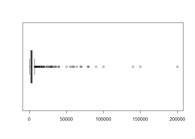
I was digging in the dataset I received (for confidintiatlity reasons, I am not using the exact date), and I wanted to plot the distribution of one variable which was very heavy tailed (contained lots of extreme values). I had to submit static graphs, or that is what I assumed, and I did not have the time to work on an interactive graph or a Shiny App. It was hard to display all the data in a histogram on the same scale. And a normal boxplot would not show the values clearly as in the following plot.
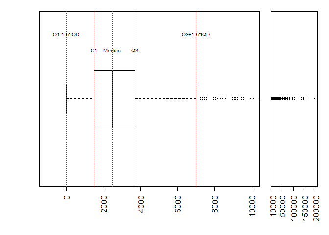
So I thought about using a boxplot where I could magnify the box-whisker part and compress the extreme values on a another scale as follows:
When Did I start to Doubt My Choice?
At this point, I started to question the choice of a boxplot. My inner voice told me, you were not familiar with boxplots till last year, why are you so confident that others will grasp it easily?. Unfortunately, I ignored this voice and assured myself that my audience were from tech. background and it would be simple for them to get it with the accompanying notes in my report or with a quick explanation in my presentation.
In addition, I did not just use one boxplot, I used faceted-grouped boxplots, with colors for sub categories and jittered points overlaying the boxplot!! I wanted to show lots of info in one plot, which was the worst choice ever. My inner voice talked again raising doubts about my choice, but I argued back that it was just a preliminary exploratory analysis and this could be enhanced later depending on the questions of interest. And I submitted my analysis that way!
When Did I Make Sure It Was a Bad Choice?
I went to discuss my analysis with four engineers and as expected we stopped at the boxplots for further clarification. Moreover, in my report, I used a brief vague description of the plot saying that it “represents the reasonable range” of the variable, which got them confused. It was not clear what this boxplot represented, what “the reasonable range” meant” and what the highlighted points were?! I had to explain the Quartiles and the Inter-Quartile Distance(IQD), which was worse, because these terms are less known than the quantiles.
At this point I realized that I made a big mistake ignoring my inner analytical voice. I had to pick a better graphical representation. And I learnt that:
-
I shouldn’t have used a boxplot unless I had been sure that all the audience were familiar with it.
-
I should have put more effort in picking the simplest chart/s to highlight what I wanted to communicate.
-
I shouldn’t have packed one chart with lots of data in forms of groups, facets, colors..etc. unless they helped conveying the message.
So that is how I learnt to listen to my inner analytical voice and not to ignore any concerns when it comes to the clarity of data visualization. Because as they say “Data needs context and clarity to connect with audience”.